Logos
Hamilton Stern
2023
2023
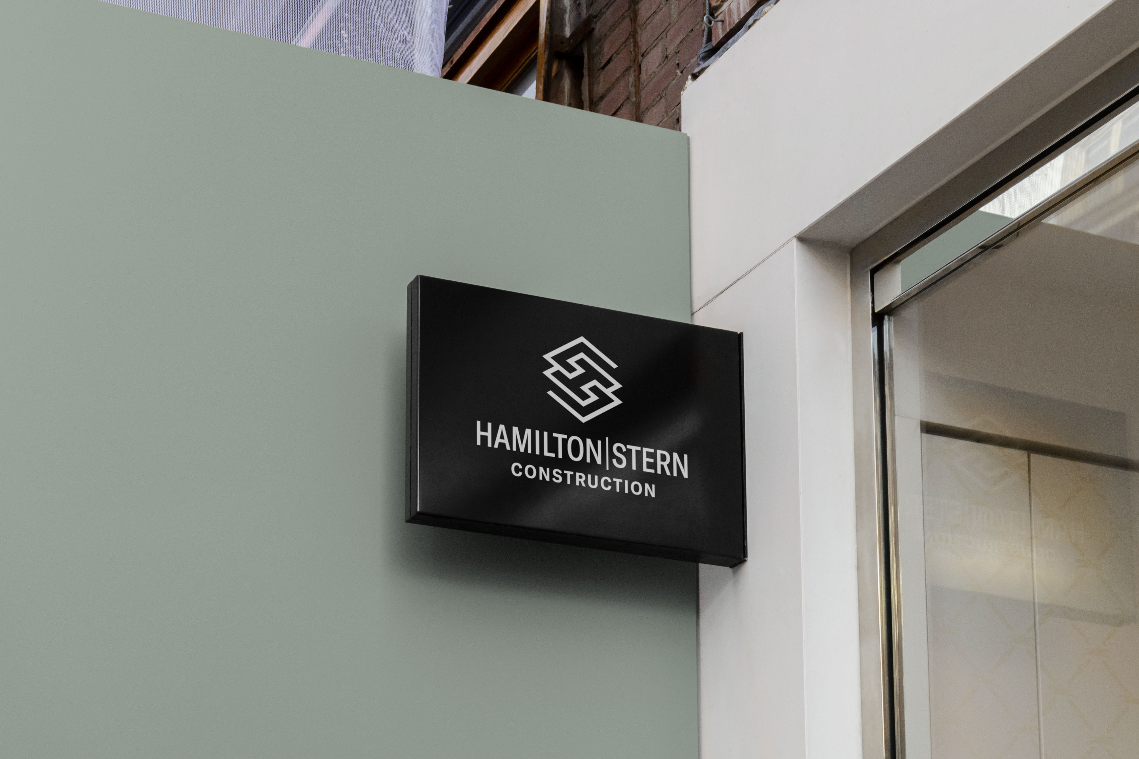
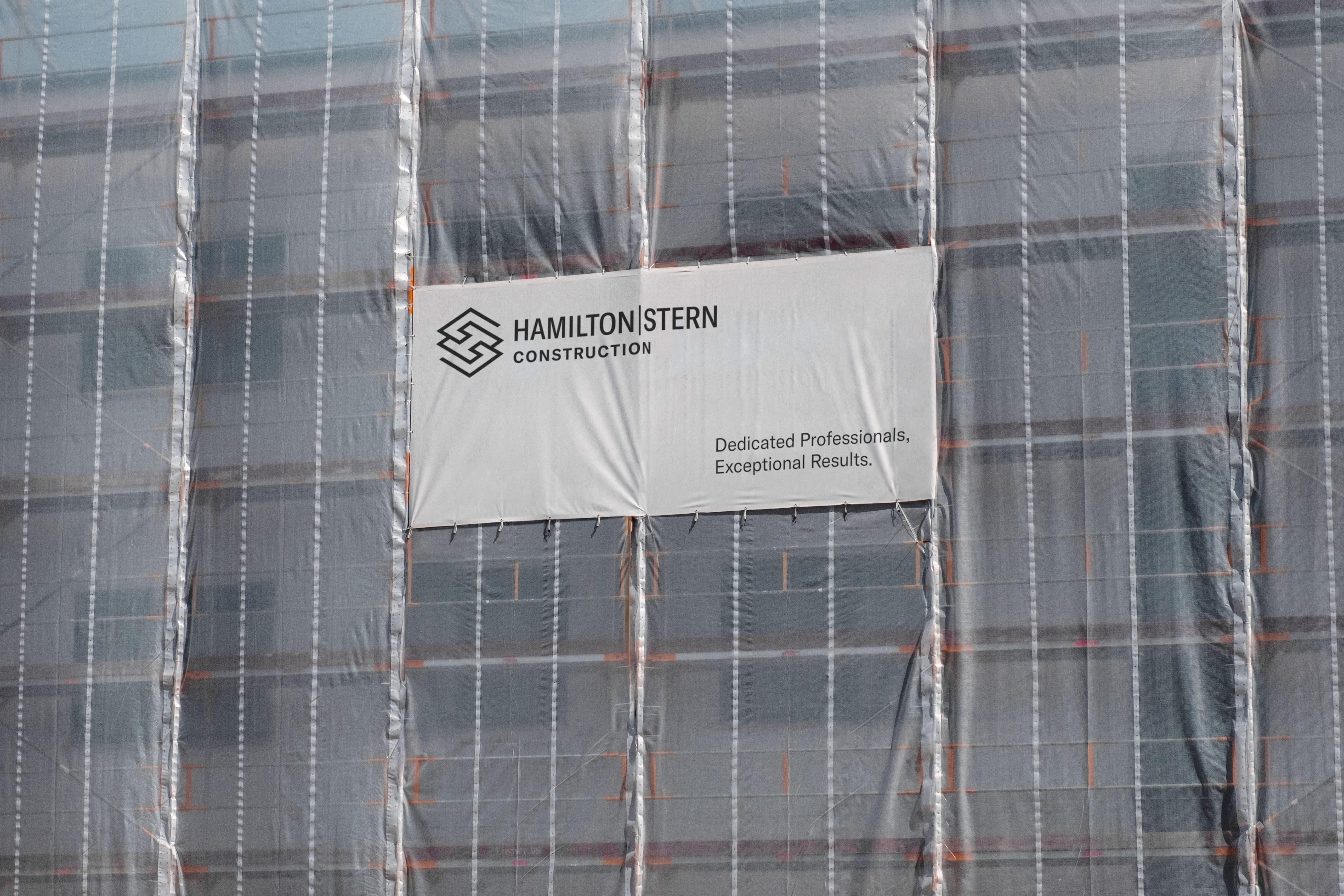
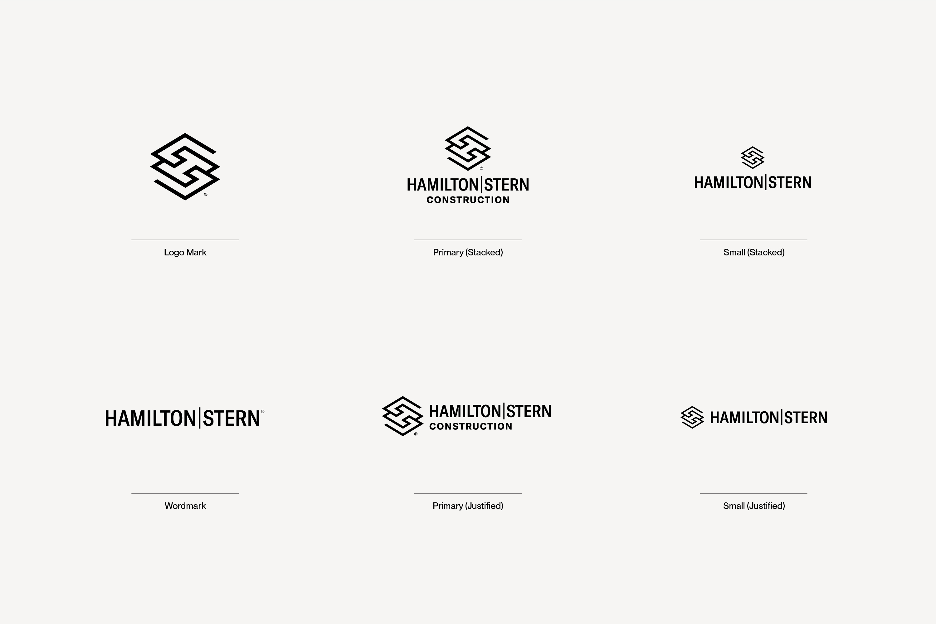
Hamilton Stern is a construction management company based in western New York, specializing in commercial and residential projects, which includes design-builds, general contracting, and interior design services.
The direction for this logo was to represent an “H” and “S” while referencing architectual elevation drawings and being inspired by the construction process and layers of a building.
The direction for this logo was to represent an “H” and “S” while referencing architectual elevation drawings and being inspired by the construction process and layers of a building.
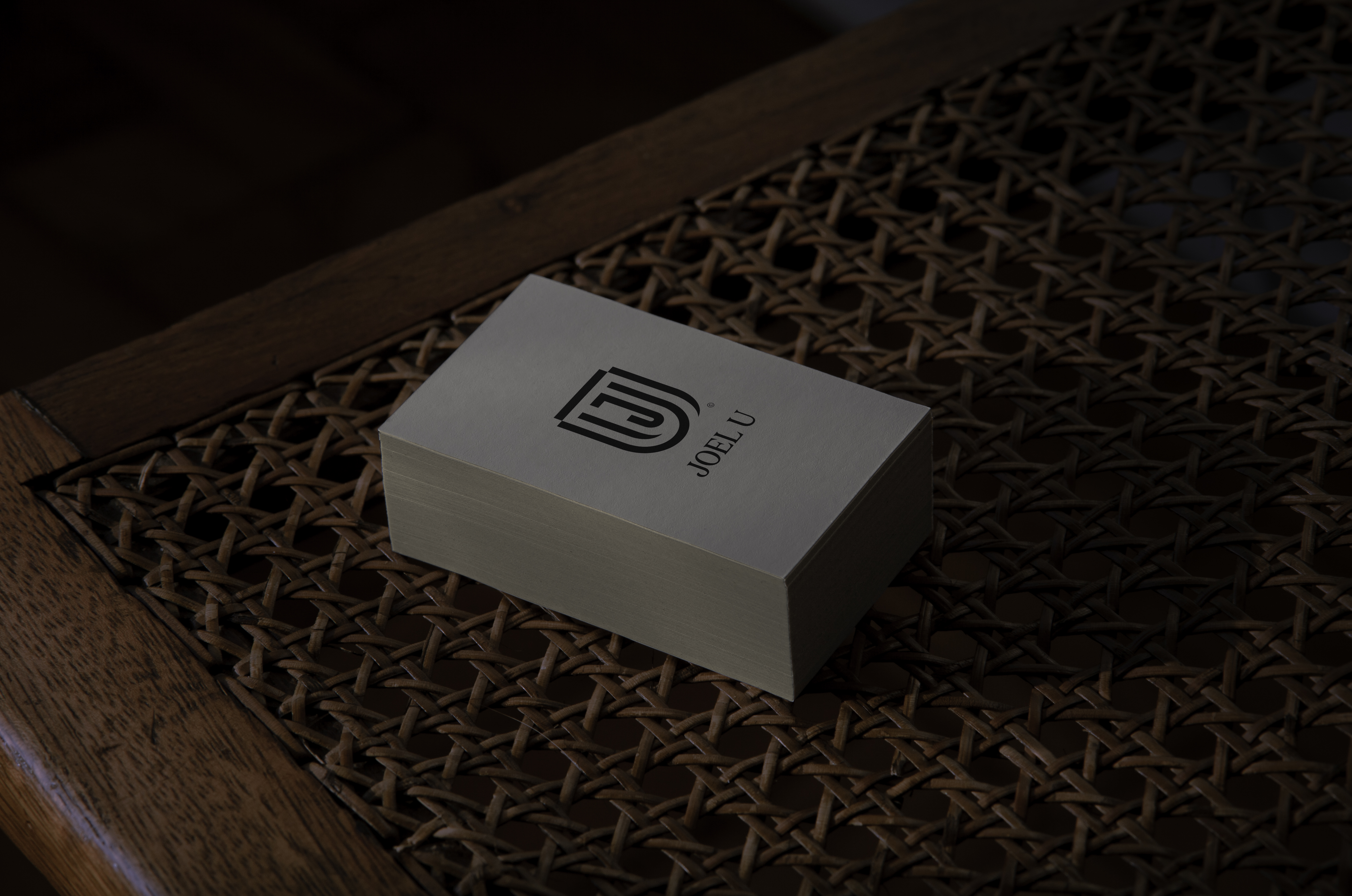

JOEL University
2022
2022
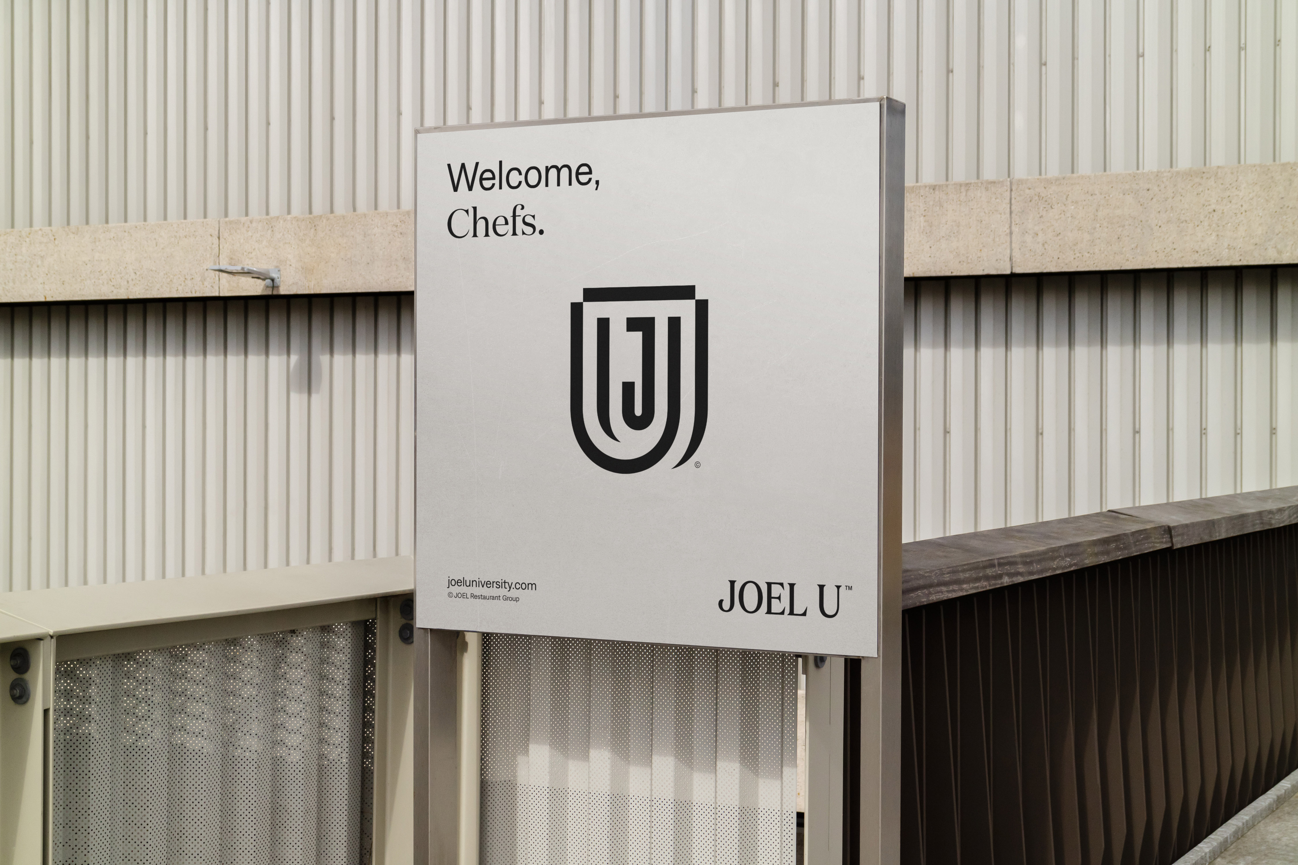
JOEL University is a business school built on hospitality and culinary pillars. It offers various learning, development, and skill refining courses and programs, for both partners and leaders of their restaurant group, across Canada and the United States.
The direction for this logo was to represent a “J” and “U” while referencing pillars and being inspired by the concept of libraries, schools, and educational programs.
The direction for this logo was to represent a “J” and “U” while referencing pillars and being inspired by the concept of libraries, schools, and educational programs.

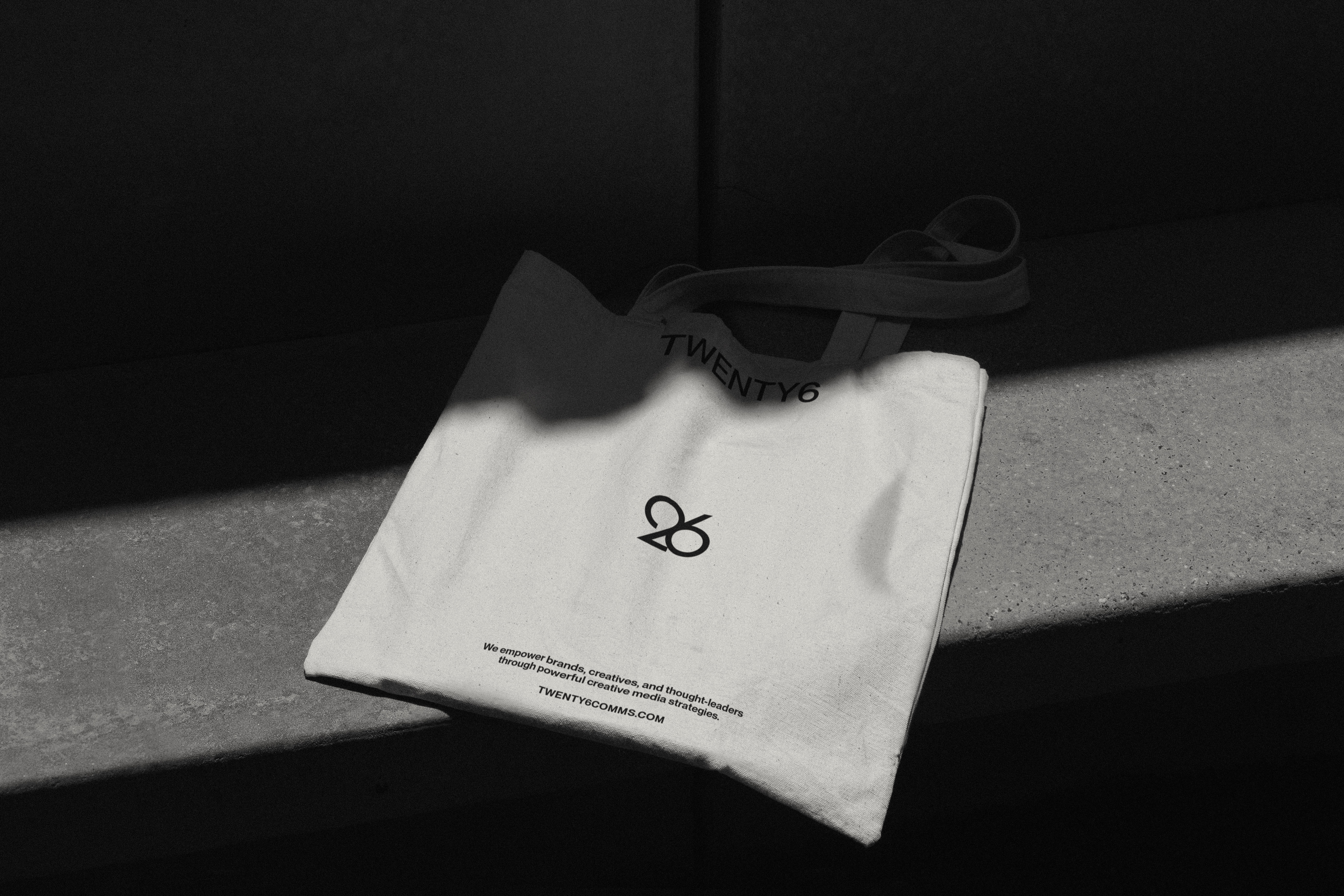
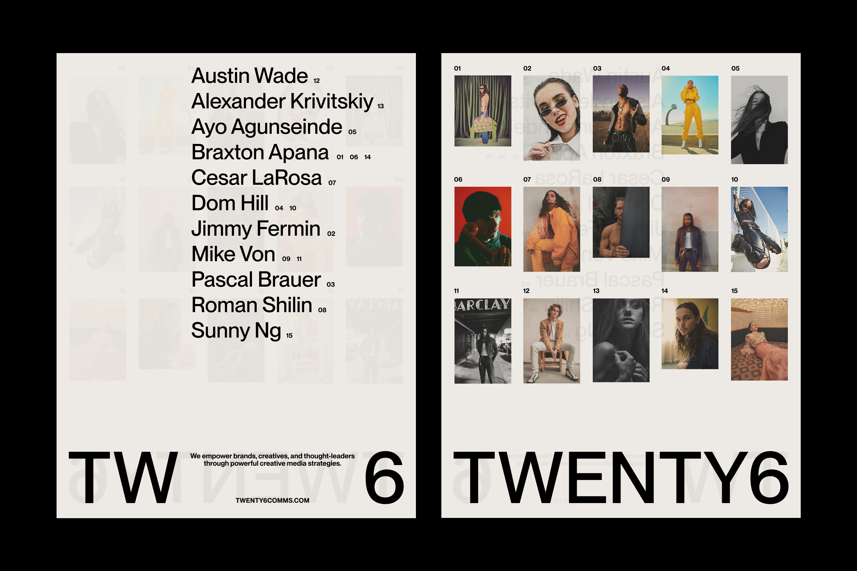
TWENTY6
2022
2022
TWENTY6 is an integrated communications and marketing agency empowering brands, creatives, and thought-leaders through creative media strategies on behalf of lifestyle and luxury brands within the fashion and wellness industries, using content strategy, influencer marketing, campaign activations and events to generate engagement.
The TWENTY6 logo mark is strong and balanced. The circular forms of the "2" and "6" are meant to mimic a yin-and-yang concept, seen to influence health and order within an individual, society, and the entire universe. A clear and bold wordmark respectfully captures the class and culture of TWENTY6. This wordmark communicates to all age groups, acknowledging the diversity of community and culture. The same design principles of this wordmark can easily be translated to different languages.
The TWENTY6 logo mark is strong and balanced. The circular forms of the "2" and "6" are meant to mimic a yin-and-yang concept, seen to influence health and order within an individual, society, and the entire universe. A clear and bold wordmark respectfully captures the class and culture of TWENTY6. This wordmark communicates to all age groups, acknowledging the diversity of community and culture. The same design principles of this wordmark can easily be translated to different languages.
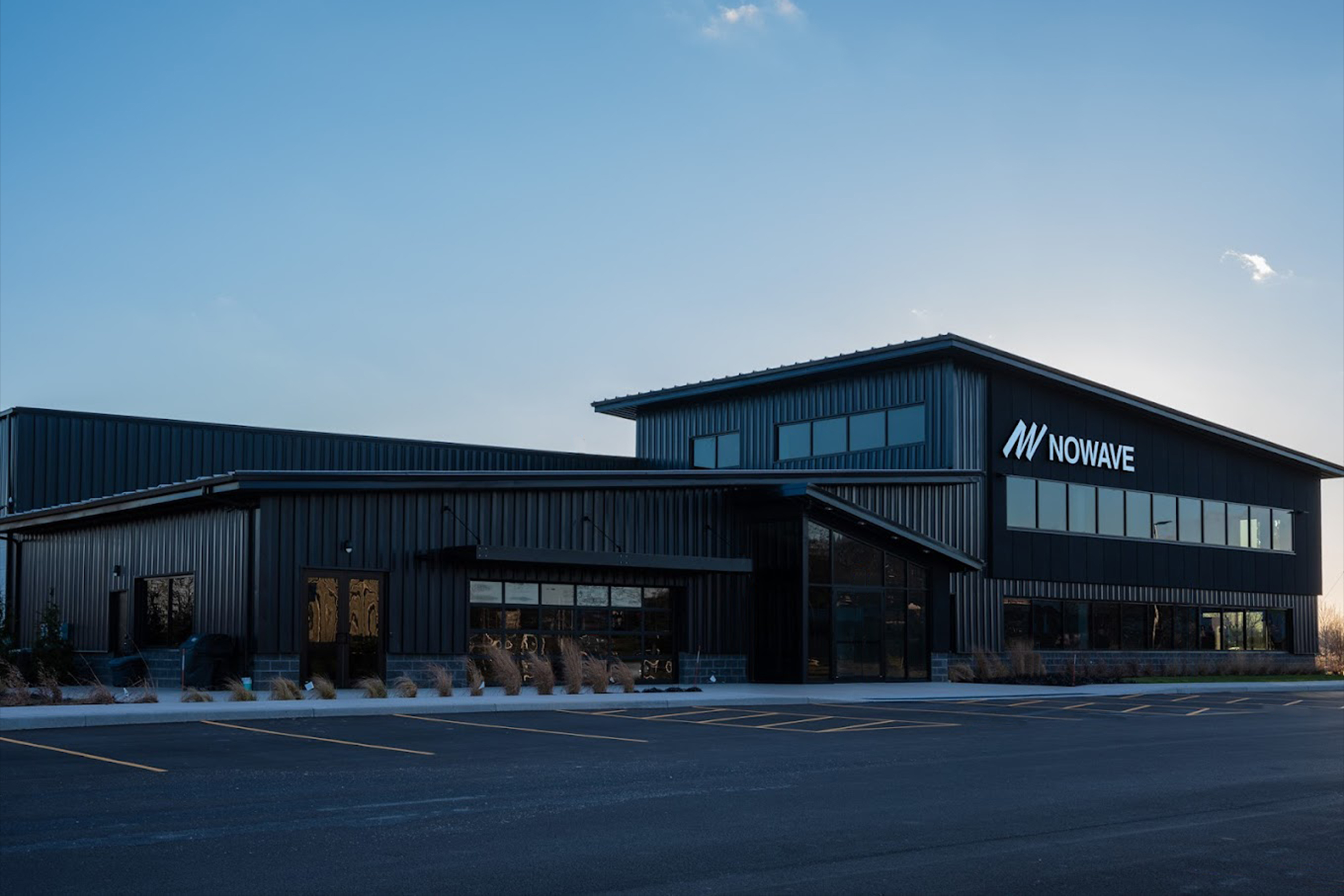
NOWAVE
2022
2022
NOWAVE specializes in cannabis extractions and packaged goods, providing the resources and expertise necessary to develop successful brands by manufacturing consistent, high-quality infused products for the New York market and beyond.
The direction for this logo was to represent a “/” for “no” and a “W” for “wave” in a bold structure that represents progress and motion. Creative direction provided by Doug Suraci.
The direction for this logo was to represent a “/” for “no” and a “W” for “wave” in a bold structure that represents progress and motion. Creative direction provided by Doug Suraci.
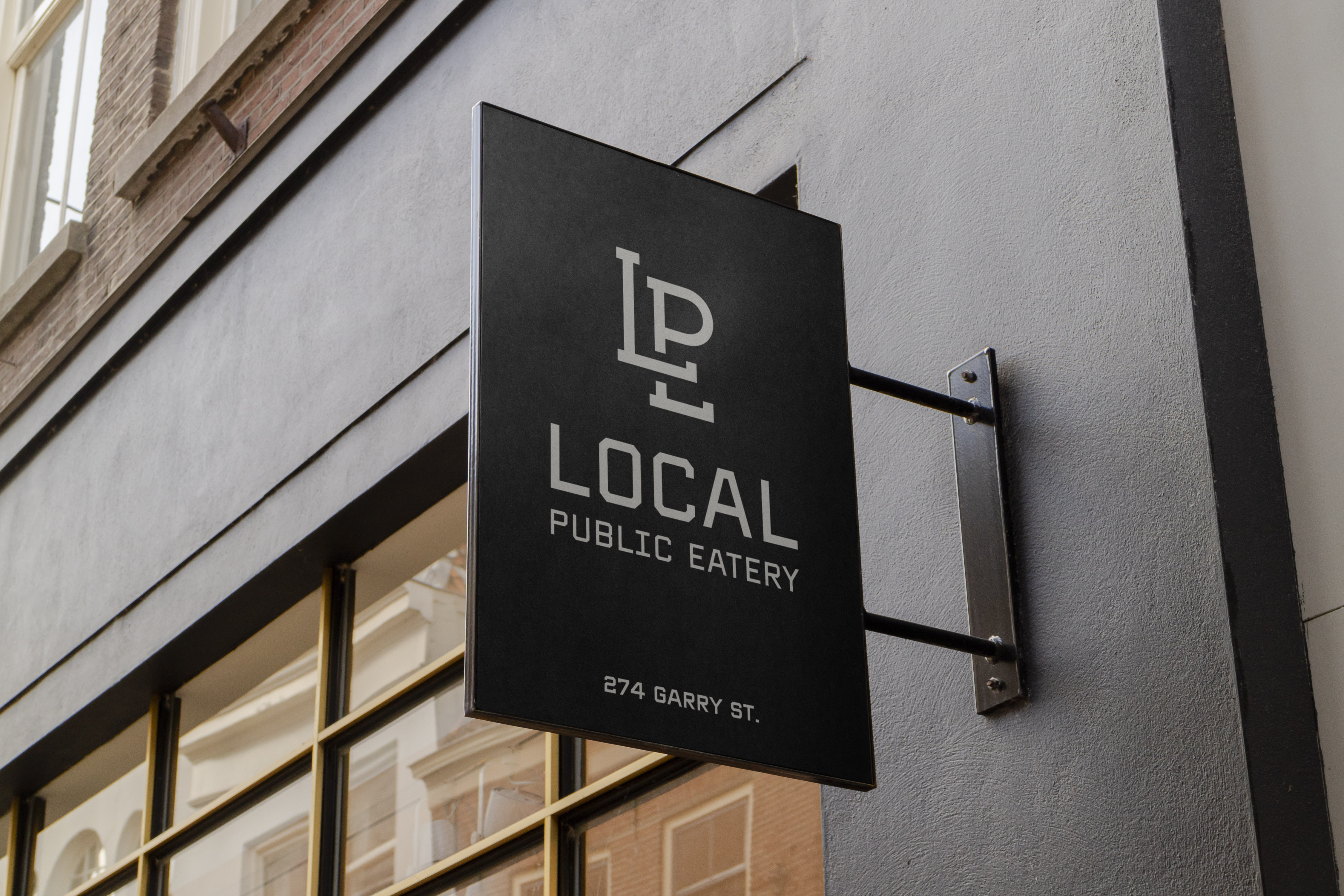
Local Public Eatery
2021
2021
Local Public Eatery is your neighbourhood gathering spot, with restaurants across Canada and in Seattle, bringing family and friends together over local craft beer, wine, cocktails, and elevated food that comforts the soul, sports, and social games.
The direction for this rebrand was driven by the desire to not want to feel overly-branded, but instead feel natural, timeless, and versatile, adapting to each location in its own unique way. The “LPE” monogram was initially inspired by traditional baseball logos, which not only captures the sports culture Local Public Eatery embraces, but how team logos represent more than just the game, they represent an entire city, a culture, an attitude. Brand direction and creative direction provided by JOEY Restaurant Group.
The direction for this rebrand was driven by the desire to not want to feel overly-branded, but instead feel natural, timeless, and versatile, adapting to each location in its own unique way. The “LPE” monogram was initially inspired by traditional baseball logos, which not only captures the sports culture Local Public Eatery embraces, but how team logos represent more than just the game, they represent an entire city, a culture, an attitude. Brand direction and creative direction provided by JOEY Restaurant Group.


CareerStart
2021
2021
CareerStart is a full-service employment firm, staffing for residents in upstate New York, with access to jobs across the United States. Whether clients need work for a single shift, or a career for a lifetime, CareerStart finds solutions for both working professionals and employers.
The CareerStart logo is bold and motivational, while subtle characteristics provide deeper meaning to the brand. A lot of personality comes through in the logomark, inspired by the concept of: Get the ball rolling. The logomark was designed to create the letters “CS” from perfect circles to capture the concept, and the idea, of moving forward. This project was provided by Brandmint Marketing & Advertising agency in Rochester, New York.
The CareerStart logo is bold and motivational, while subtle characteristics provide deeper meaning to the brand. A lot of personality comes through in the logomark, inspired by the concept of: Get the ball rolling. The logomark was designed to create the letters “CS” from perfect circles to capture the concept, and the idea, of moving forward. This project was provided by Brandmint Marketing & Advertising agency in Rochester, New York.
Collaboration with Brandmint

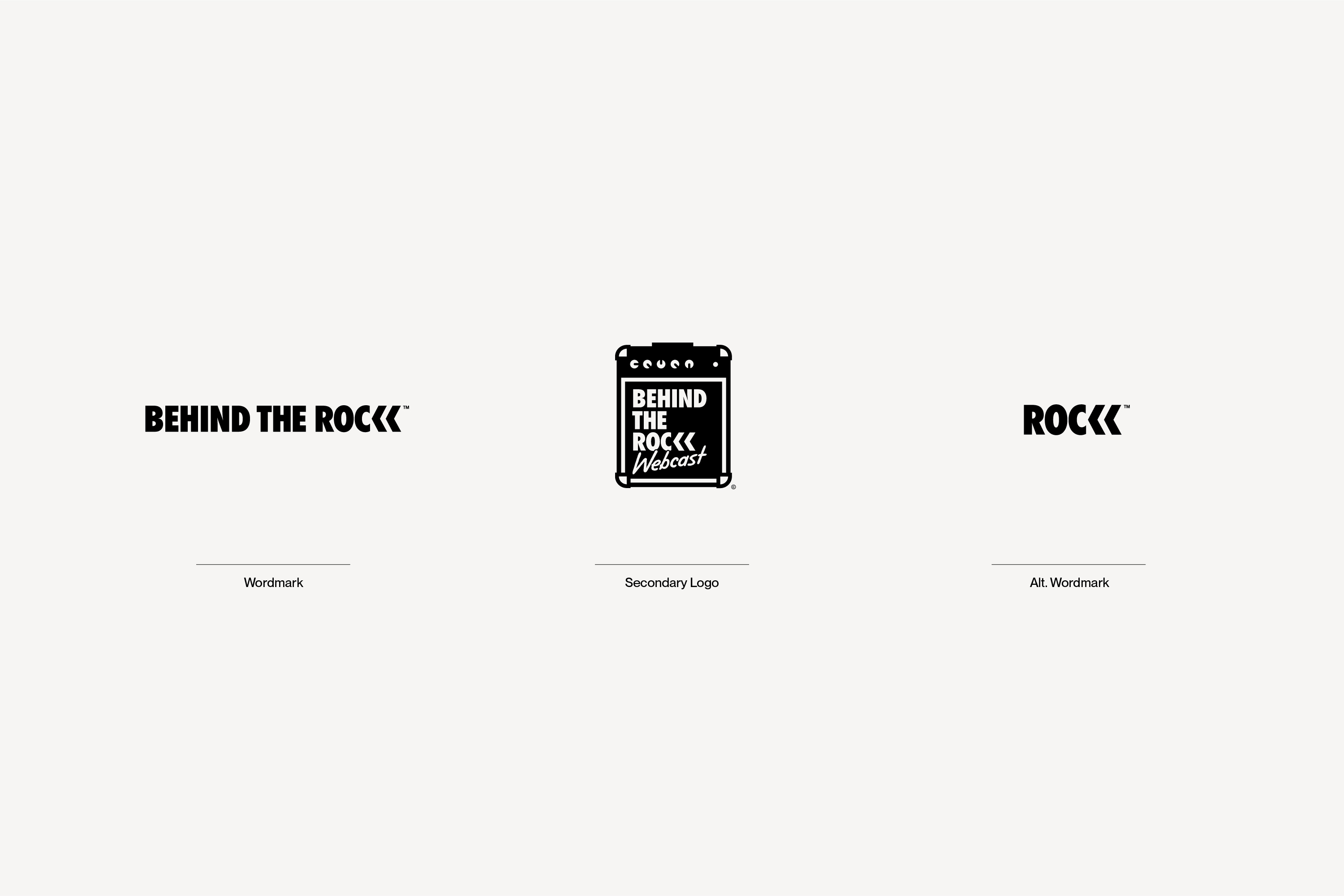
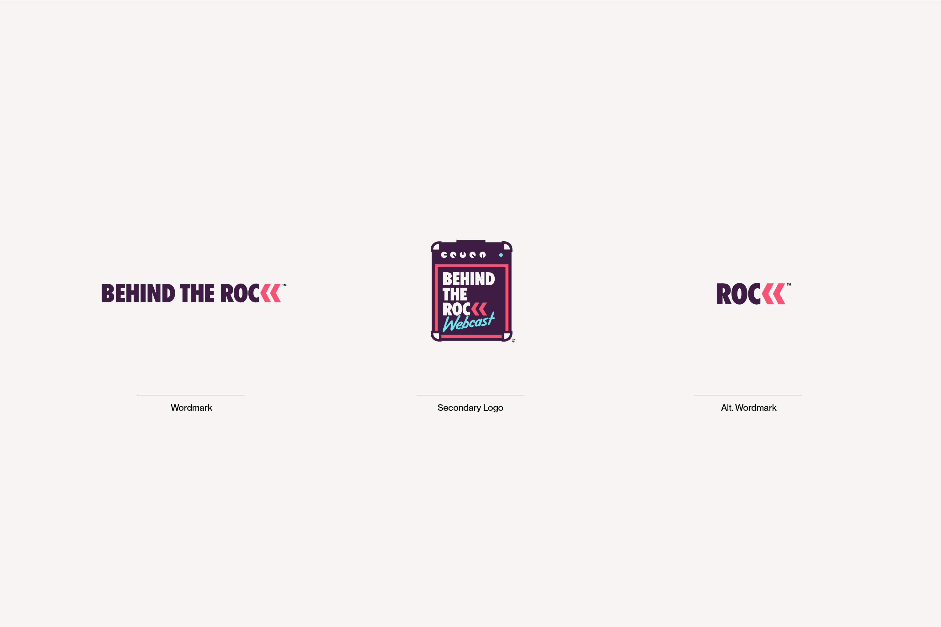
Behind the ROC
2021
2021
Behind the ROC is primarily a webcast, hosted by Michael Falzano, livestreaming concerts in the greater Rochester, New York area and interviewing musicians, club owners, and fans of the music.
The concept for this logo came from the name, which combines “rock” and “ROC” (Rochester), referencing the behind-the-scenes look at music, specific to Rochester, with backward-pointing arrows creating the illusion of the word “rock.” Specifically for the webcast logo, the amplifier references where the music comes from as if it is broadcasting directly from the speakers.
The concept for this logo came from the name, which combines “rock” and “ROC” (Rochester), referencing the behind-the-scenes look at music, specific to Rochester, with backward-pointing arrows creating the illusion of the word “rock.” Specifically for the webcast logo, the amplifier references where the music comes from as if it is broadcasting directly from the speakers.
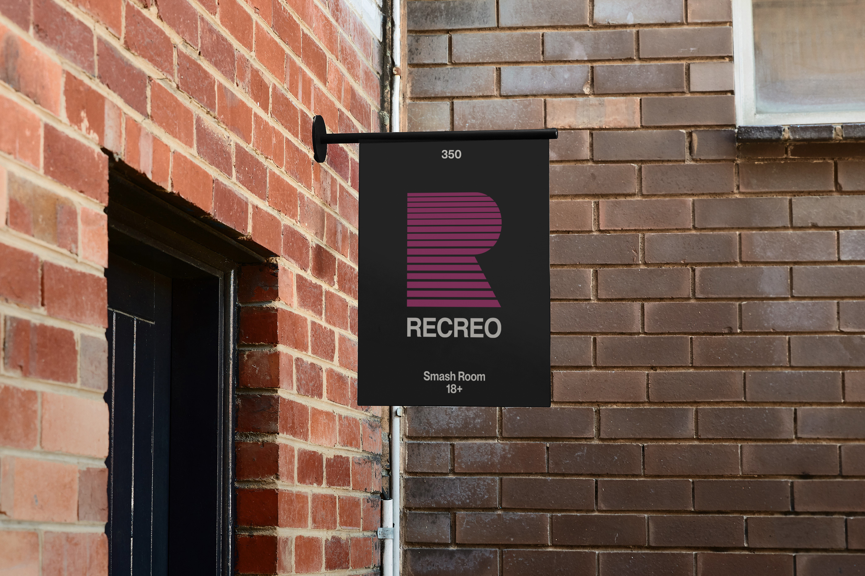
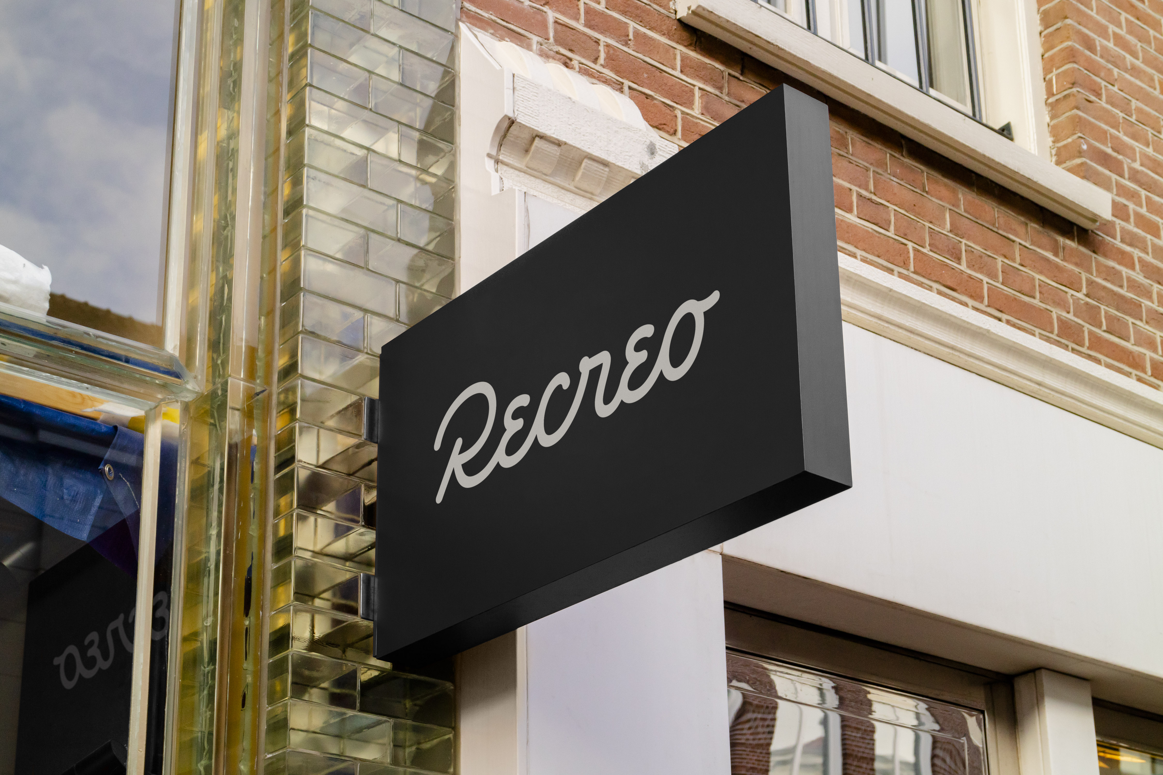
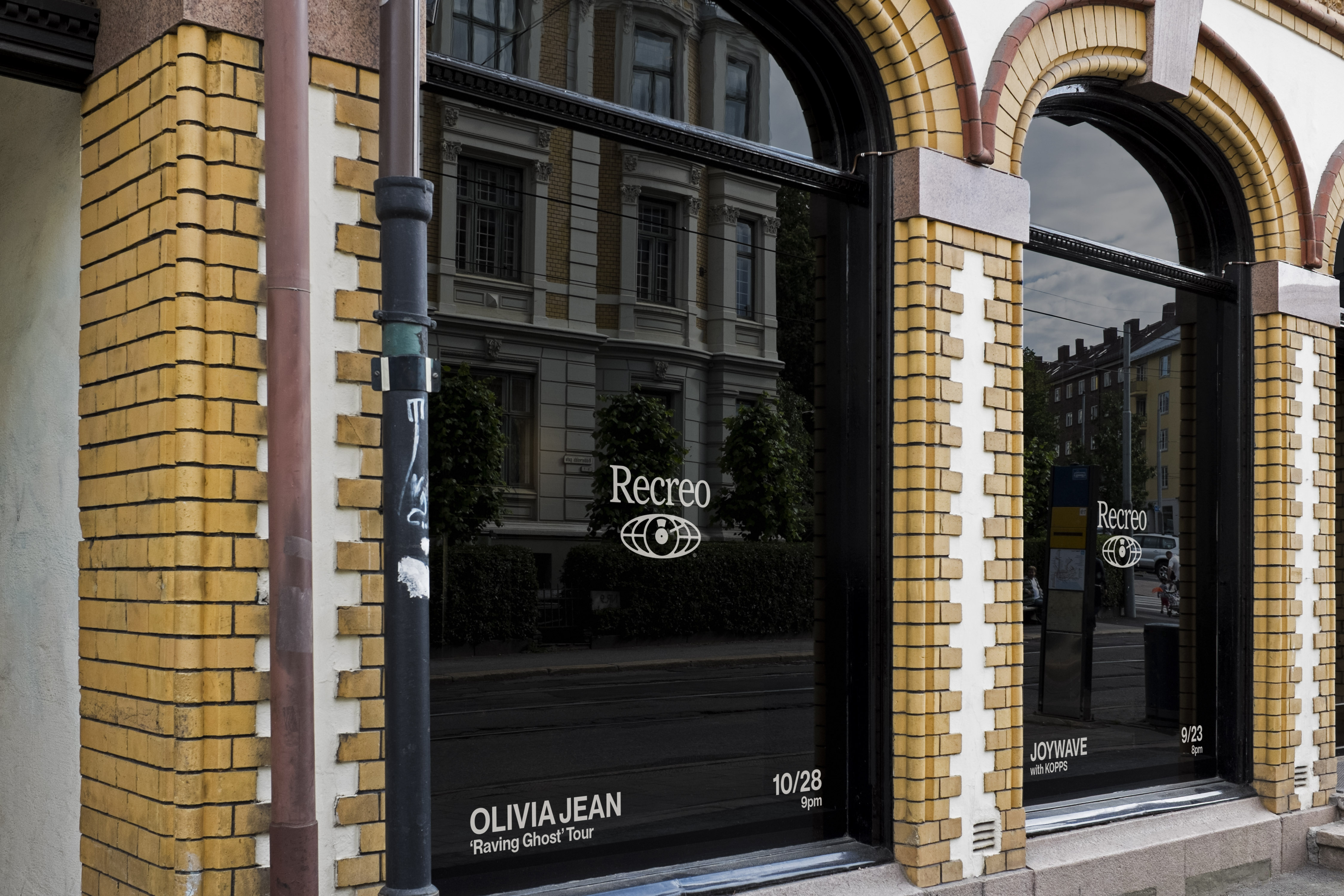

Recreo
2021
2021
Recreo is a dive bar, smash room, and event space inspired by urban city life, with murals from well known street artists, serving specialty cocktails under the facade of a shipping container.
Recreo’s branding is made up of three distinct logos to represent their diverse services. The bar/kitchen logo is meant to feel happy and social, the smash room and gaming logo is a nod to 80’s arcade nostalgia, and the events logo is meant to feel universal, bringing all types of talent to the space, with a focus on music and entertainment. All these logos were intended to be used on swag and merchadise.
Recreo’s branding is made up of three distinct logos to represent their diverse services. The bar/kitchen logo is meant to feel happy and social, the smash room and gaming logo is a nod to 80’s arcade nostalgia, and the events logo is meant to feel universal, bringing all types of talent to the space, with a focus on music and entertainment. All these logos were intended to be used on swag and merchadise.

Checkin
2021
2021
Checkin was an online platform and social network creating a place for people to talk and support each other with similar life experiences.
The Checkin wordmark is clear and casual, while subtle characteristics provide deeper meaning. The difference in lettering styles provide slight separation to improve legibility while working as one word. The first portion of the wordmark captures the familiarity we all have with sans serif text, which is a clear, approachable way to deliver information. The hand-written script is inspired by the nostalgia of a phone cord to symbolize human connection and casual conversation.
The Checkin wordmark is clear and casual, while subtle characteristics provide deeper meaning. The difference in lettering styles provide slight separation to improve legibility while working as one word. The first portion of the wordmark captures the familiarity we all have with sans serif text, which is a clear, approachable way to deliver information. The hand-written script is inspired by the nostalgia of a phone cord to symbolize human connection and casual conversation.
Collaboration with Also Dept.

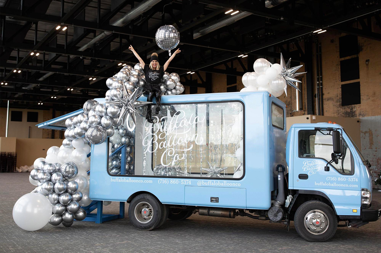
Buffalo Balloon Co.
2021
2021
Specializing in balloon decor and event planning, Buffalo Balloon Co., founded by Lydia Dominick, has worked with high-profiled clients such as the Buffalo Bills NFL team and New Era.
The concept for this logo came from wanting to create something completely unique, with hand-written typography, to symbolize how Buffalo Balloon Co. creates unique decor catered specifically for you and your special day.
The concept for this logo came from wanting to create something completely unique, with hand-written typography, to symbolize how Buffalo Balloon Co. creates unique decor catered specifically for you and your special day.

Prince Development Group
2020
2020
Prince Development Group is a real estate company that invests, manages, and develops residential properties in New York and Florida.
The direction for this logo was to proudly represent the letter “P” while referencing the company’s marketplace of large and small houses.
The direction for this logo was to proudly represent the letter “P” while referencing the company’s marketplace of large and small houses.


Birdie’s
2020
2020
Birdie’s is a cafe, oyster bar, and wine cellar located in Richmond, Virginia. Beyond the roster of raw bar delicacies, many prepared dishes are featured on the menu devised by chef de cuisine Hunter Garvin.
The concept for this logo came from wanting to create something completely unique, with hand-written typography, to symbolize the autheticity of Birdie’s menu.
The concept for this logo came from wanting to create something completely unique, with hand-written typography, to symbolize the autheticity of Birdie’s menu.

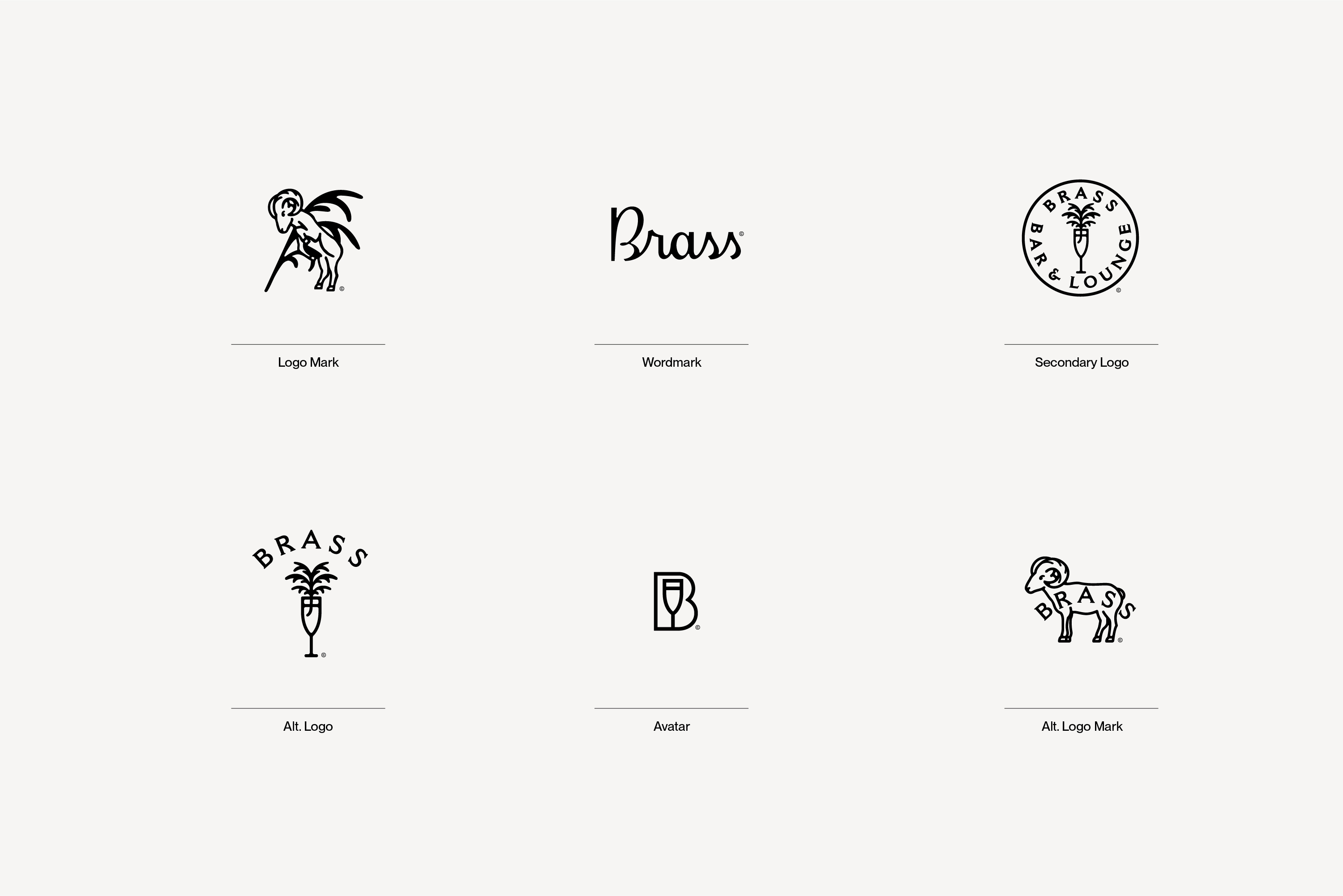
Brass
2020
2020
Brass is a luxury bar, lounge, and event space centered around bottle service and hosting private parties.
This logo was a redesign of their previous logo of a ram. The ram was elevated to feel more timeless and sophisticated. Secondary and alternative logos were added to reference Brass’ focus on quality cocktails and bottle service. A script wordmark was created to give a new-school take on luxury.
This logo was a redesign of their previous logo of a ram. The ram was elevated to feel more timeless and sophisticated. Secondary and alternative logos were added to reference Brass’ focus on quality cocktails and bottle service. A script wordmark was created to give a new-school take on luxury.
Handsome Frank
2020
2020
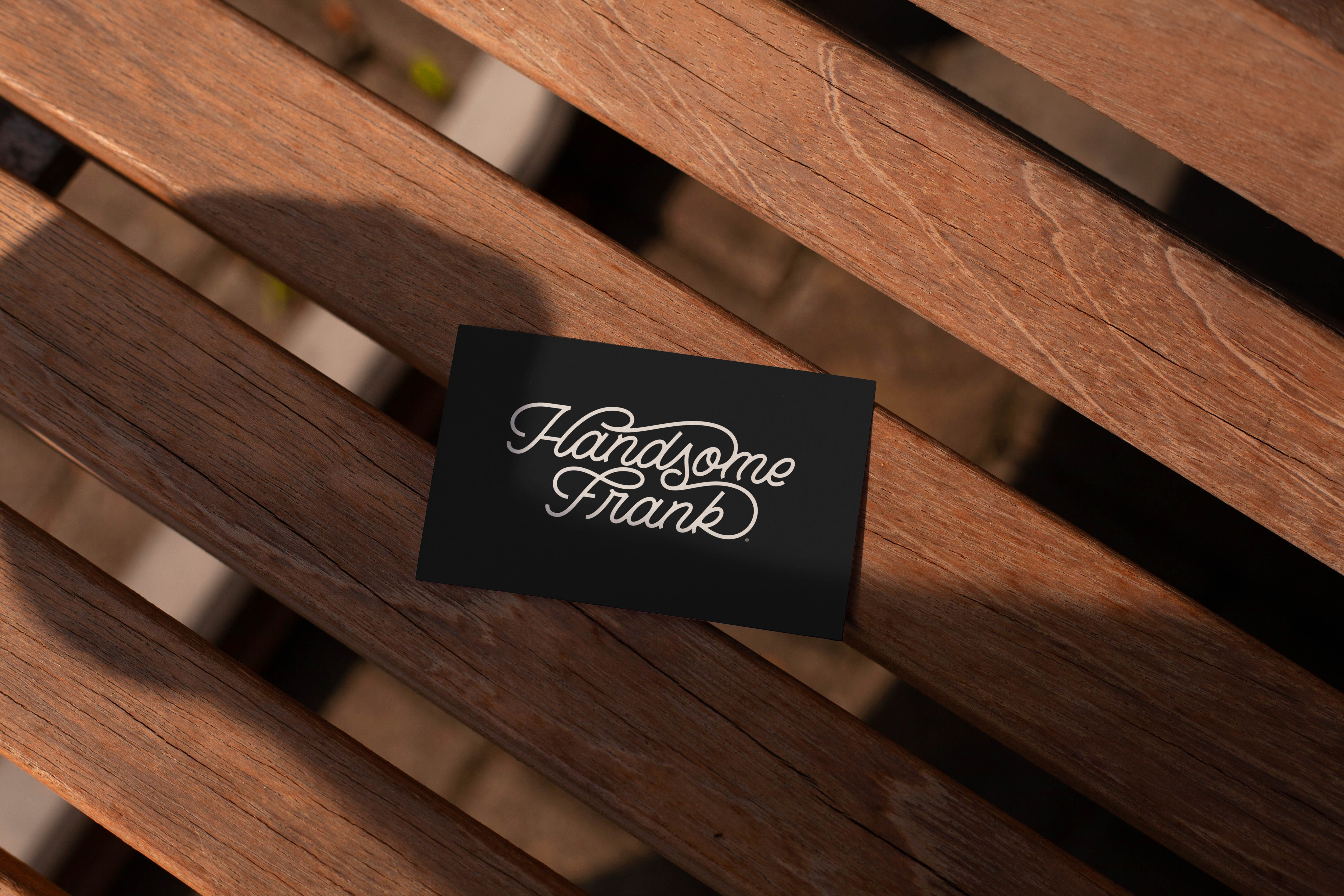
Handsome Frank is an illustration agency, based in the UK, representing some of the finest contemporary artists on the planet. A close-knit team ignores time zones and brings your ideas to life, working predominantly with clients across advertising, design, and publishing, ranging from global brands to bold start-ups, and everything in between.
Creative direction for this project came from the founders of Handsome Frank, wanting a wordmark that had a lot of character and personality. We felt single-line weight lettering was perfect for referencing the drawing/illustration aspect of the company, while flamboyant ligatures gave it that personality we were looking for.
Creative direction for this project came from the founders of Handsome Frank, wanting a wordmark that had a lot of character and personality. We felt single-line weight lettering was perfect for referencing the drawing/illustration aspect of the company, while flamboyant ligatures gave it that personality we were looking for.

Roadside Flower Bar
2020
2020
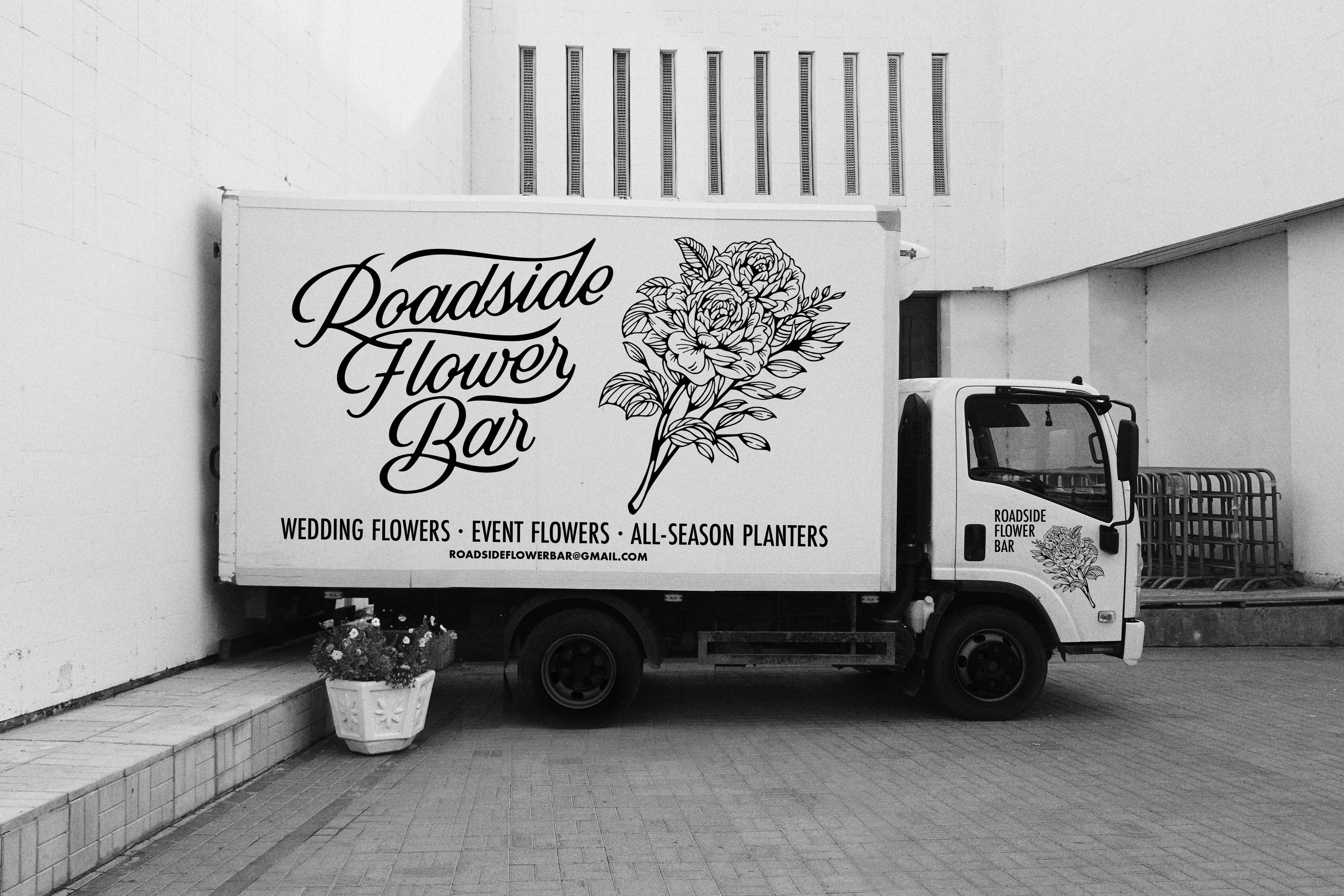
Roadside Flower Bar flowers and greenery to make decorative displays and help customers select flowers, ribbons, and other accessories for events and weddings.
The concept for this logo came from wanting to create something completely unique, with hand-written typography, to symbolize how Roadside Flower Bar creates unique florals and designs catered specifically for you and your special day.
The concept for this logo came from wanting to create something completely unique, with hand-written typography, to symbolize how Roadside Flower Bar creates unique florals and designs catered specifically for you and your special day.

Last Abbott Brewing Co.
2016
2016
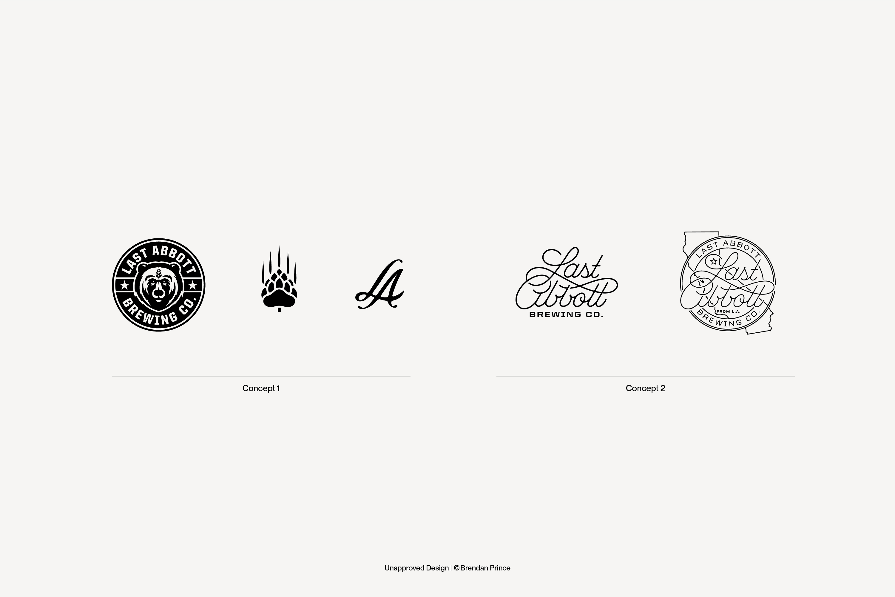
Last Abbott was a concept for a brewery in west Los Angeles that never launched. The direction for this logo was to represent beer and California, so a bear claw was designed as a barley hop and an alternative mark was designed to emphasize the initials “L.A.” for both Los Angeles and Last Abbott.
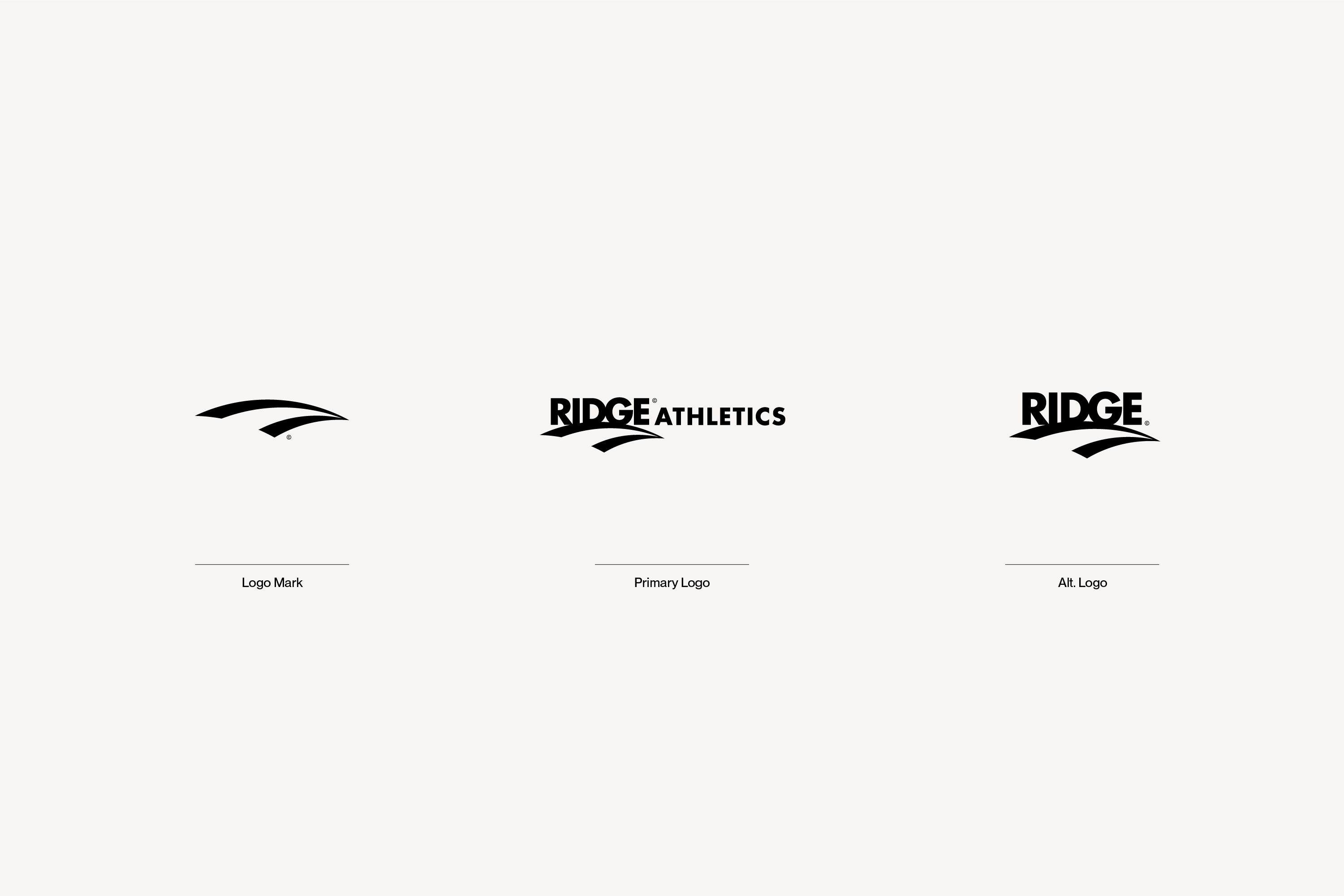
Ridge Athletics
2015
2015
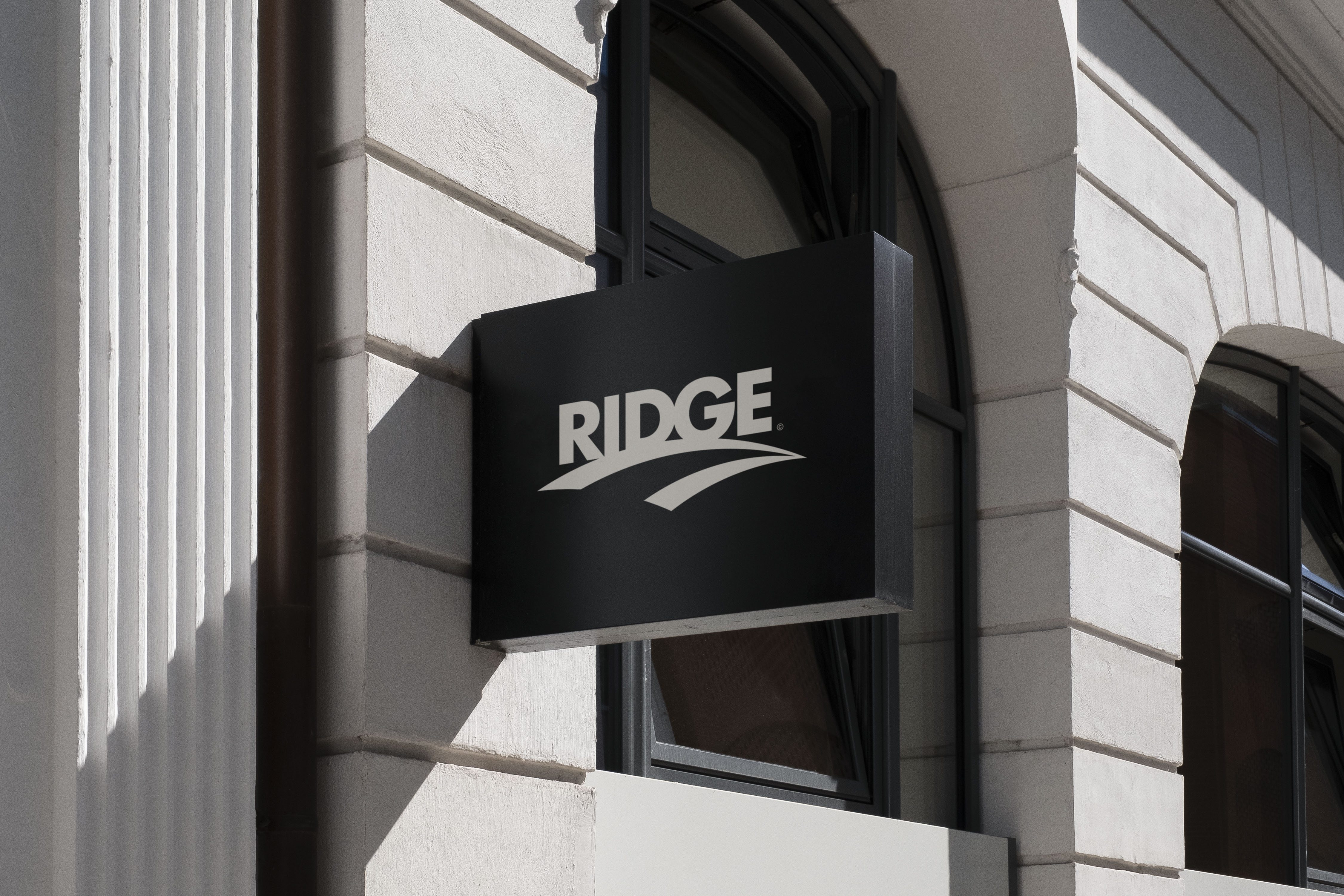
Ridge Athletics was a concept for an athletic performance brand that never launched in the UK. The concept for this logo was to create a mark that felt athletic and timeless. The merging lines create an infident road and references the literal definition of the name Ridge: the line made where two sloping surfaces come together.
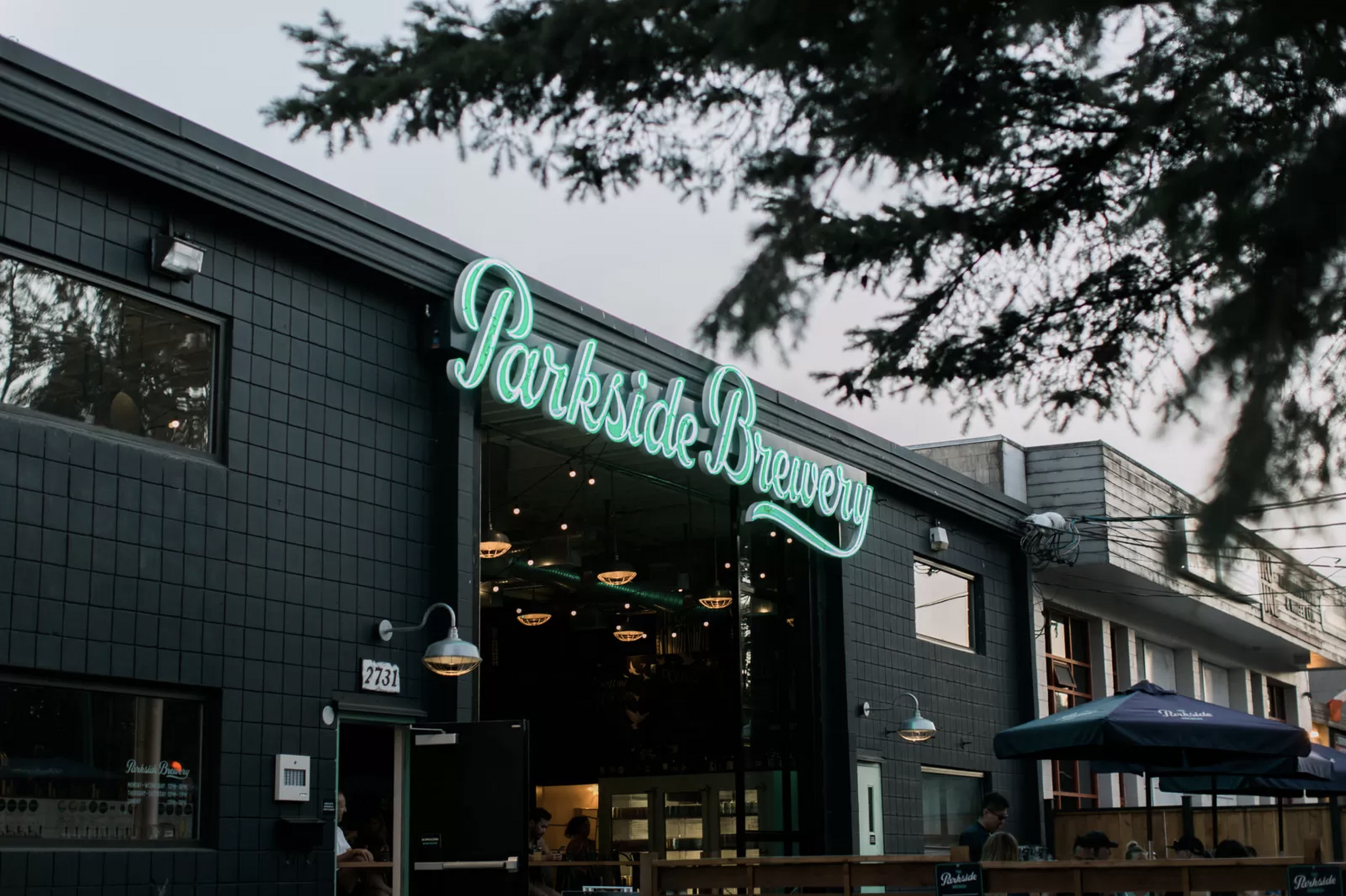
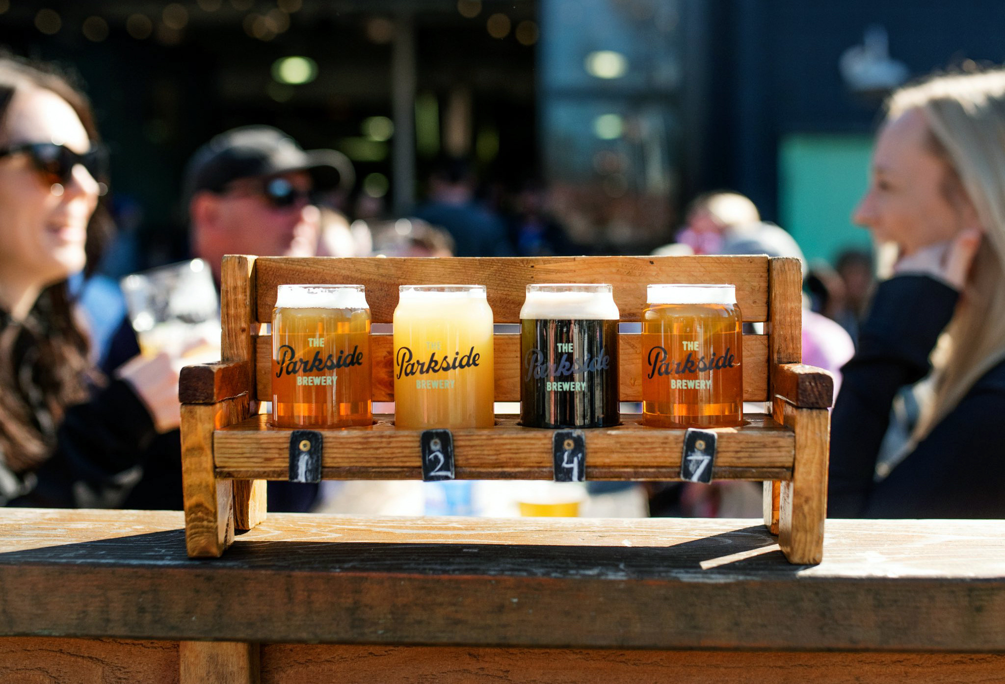
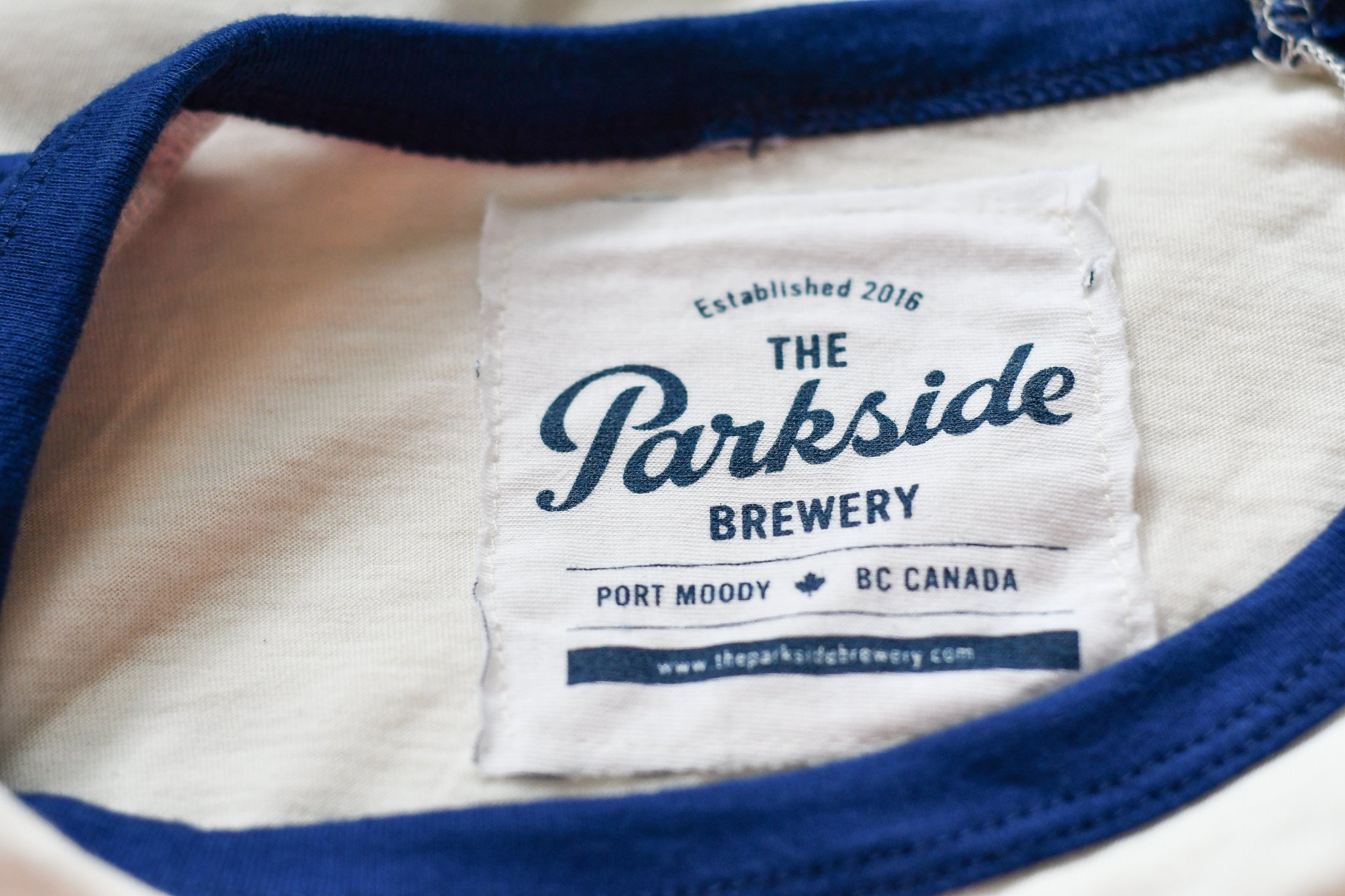

The Parkside Brewery
2015
2015
The Parkside Brewery is located just outside Vancouver, Canada, in Port Moddy, a small and thriving community surrounded by nature. Nestled at the foot of Eagle Mountain, the protected harbour invites boating and kayaking, while the forested parklands above are quintessential west coast wilderness, offering hiking trails, lakes and mountain vistas.
The goal was to create a logo with custom typography and to develop a brand that captured the beauty found in the surrounding nature near the brewery and the spirit of the community.
The goal was to create a logo with custom typography and to develop a brand that captured the beauty found in the surrounding nature near the brewery and the spirit of the community.
SERVICES
Brand Identity
Logo Design
Lettering
Custom Art
Brand Identity
Logo Design
Lettering
Custom Art
©2024 Brendan Prince